| Product(s): |
WaterSight |
| Version(s): |
10.00. |
| Area: |
Documentation |
Overview
The graph comparison page allows the user to:
- Compare different measurements in a single graph to better explore and understand the relations between any set of phenomena (for example a flow increase in a zone followed by a pressure decrease can be an indication of a burst; a flow increase followed by a flow decrease, by the same amount, in adjacent zones can be indication of zone boundary changes; a flow increase followed by an increase in the pressure immediately downstream the PRV may be be an indication of PRV setting point mismatch; an increase in the zone flow can be due to an increase in the large customer consumption; etc)
- Compare different periods in the same graph, for example compare this summer period with last summer period; compare this Christmas period with last Christmas period, etc.
- Compare real time data for different measurements with the expected data (patterns)
- Compare real time data for different measurements with the calculated modelled data (based on the hydraulic model)
There are different ways of accessing this page:
- Directly from the sensors or zones details graph, using the compare shortcut button
 . Particularly useful when when the user is doing some investigation looking at the individual sensor or zone graphs, and is looking for some relations between that specific measurement and other variables
- Directly from the events detail graph, using the compare shortcut button . Particularly useful when when the user is trying to potentially understand the cause of the events before sending team work to field
- Directly from the side menu, under Network Monitoring > Comparison. Particularly useful when when the user already knows which measurements he wants to analyze together, and probably is interested in saving some default comparison graphs so he can often monitor. The very first time the user accedes the Comparison page, it will display an empty page.
Note - importance of associating or comparing large customers flows with zones flow, to improve response to zone alerts. Whenever a zone alert is automatically generated by the solution, and in case that zone includes large customers with smart meter data, please make sure to always compare zone flow with the large customer flow to discard potential consumptions. Another option is to create a new zone and include, in the zone balance, the large customers as outflow of the area. In this case, whenever a zone alert is generated, the customer consumption is already discarded (please make sure the original zone with the large customer included is also kept, so we can correctly track the water balance components for the zone).
New Graph Comparison
The very first time the user accedes the Comparison page, it will display an empty page. To add and save a new graph:
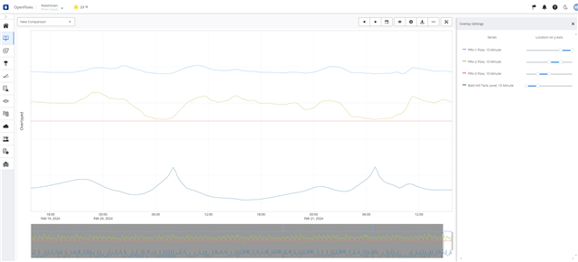
- start by adding new variables to the graph, by selecting those in the right side panel.
- Save the new graph comparison selection by clicking in the New button located on the top of the right side panel (if the New button is not pressed, all changes will be lost once exiting the page).
- By default the graph will be saved under the default name "New Comparison". To change the name just enter a new Name and click Save button
To create and save another new graph comparison in case there is at least one created:
- Click New on the right side panel; this will create a copy of the previous selected graph
- Now change or add more variables/measurements for the comparison, by selecting them on the right side panel
- Update the name and click save
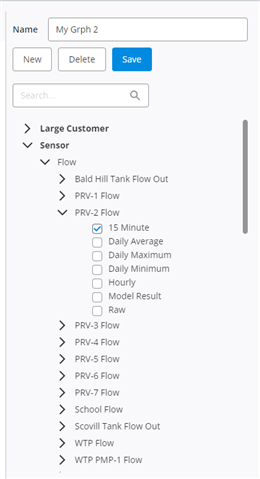
Series Tree
The variables or measurements to be selected are grouped in the following categories:
- Large Customer
- Sensor
- Zone
- Weather
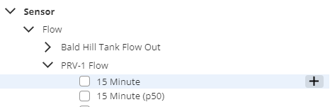
The user can select multiple series from the different categories mentioned above and also select within the different parameters available. Below the parameters available when selecting the Sensor or Large Customer categories:
- 15 minute - Real time series values resampled every 15 minutes time step
- 15 minute (p50) - The expected measurement value (pattern) for each 15 minutes time step, based on the percentile 50th of the last month time series;
- Daily average - Average value registered each day based on the real time series
- Daily maximum - Maximum value registered each day based on the real time series
- Daily minimum - Minimum value registered each day based on the real time series
- Hourly - Real time series values resampled every 1hour time step
- Hourly (P50) - The expected measurement value (pattern) for each 1 hour time step, based on the percentile 50th of the last month time series;
- Model result - If the sensor is being used in the hydraulic model (and mapped to the model element) then it is possible to see the result calculated from the hydraulic model
Clear Series
It is also possible to clear all the selected variables with one single click by pressing the Clear button located on the bottom of the right side panel.
Show selected Series 
It is also possible to expand the series-tree to show in the right side panel the variables that are displayed in the graph by pressing the "Show selected in Series-tree button"  , also located on the bottom of the right side panel.
Comparing different time periods
To enable the different time serious periods comparison, select a category and a parameter, and then click on the plus button that appears on the right:
Select the time offset by filling the information in the pop-up dialog and click Ok:
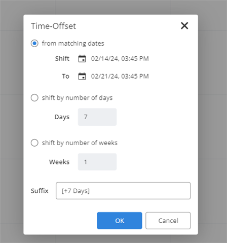
New series will be overlayed as a graph dash line. These new series are generated “on the fly” and do not get saved.
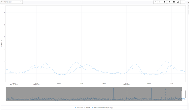
Fig 1. Comparing current flow with the flow last week (7 days back in time)
View Saved Graph Comparison
After the graph has been saved, it will be made available every time the user accesses the comparison page. To select one of the saved graphs, just select the desired one from the full list by using the dropdown button located on the top left of the page.
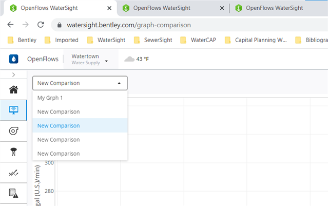
Delete Graph Comparison
Select the graph comparison to be deleted by selecting from the dropdown list located on the top left, and then click on Delete button located on the top of the right side panel.
Graphic Tools
Use the graphic toolbar to control the display of the charts:

| Entry |
Description |
 |
Turn on/off legend for the graphs |
 |
- Turn on/off "Range slider option" in graphs and define the time period for the range slider (last 3 months, last 6 months, last year, last 2 years)
- Turn on/off overlay mode (more information below)
- Select the Time range to be displayed and available in the graph comparison
|
 |
Download data that is being displayed on graphs (PNG or CSV format) |
 |
More graph configurations: spike lines, data tooltip and font size.
|
Overlay mode or adjusting Y axis scale for each time series
Sometimes may be difficult to compare different measurements between them and understand the different correlations if their y scale is very different. In that case, to better understand the correlations between the variables the user should turn on the overlay mode (or auto-scale mode) where all the variables are automatically scaled with different y axis so it is easier for the user to understand possible correlations.
The user can also click on the setting button  to adjust the y axis range for each parameter
See Also
Event detail
Zones details
Sensors details
OpenFlows WaterSight TechNotes and FAQ's